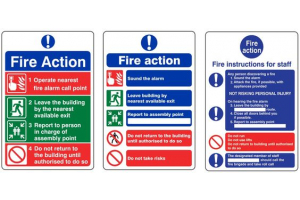
Why traffic signs?
Clear and efficient signing is an essential part of highway and traffic engineering and a road with poor signing or with badly maintained signs is an unsatisfactory road. Road users depend on signing for information and guidance; highway authorities depend on signing for the efficient working and the enforcement of traffic regulations, for traffic control, and as an aid to road safety. Signing includes not only signs on posts but also carriageway markings, beacons, studs, bollards, traffic signals and other devices.
Signs must give road users their message clearly and at the correct time. The message must be unambiguous and speedily understood; it must be given not too soon for the information to have been forgotten before it is needed, and not too late for the safe performance of consequent manoeuvres. The types of signs and carriageway markings etc, available for use are prescribed by Regulations. Limiting the number of types of sign available assists in their quick recognition as does uniformity of shape, colour and lettering for each type. It also makes available to highway authorities a set of standard signs and saves them the labour of design. It aids the courts in giving the same meaning to standard signs
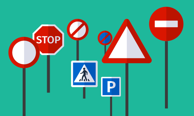
Recognising the signs
Quick recognition is further aided by using different shapes and colours for different sign groups, e.g., warning signs are triangular with black symbols, white grounds and red borders. Uniformity of signs is not however enough; uniformity of signs without uniformity in use is objectionable and could impair road safety. For instance, warning signs sited at different distances from their hazards in different districts could confuse a road user accustomed to only one district. To obtain the fullest benefits of uniformity there must not only be uniformity of signs but also uniformity in their use, in their siting and their illumination.
Seeing the signals
In order to perform the function for which it is intended a sign must be capable of transmitting its message clearly and at the right time to road users travelling at the normal speed for the road. To achieve this a sign must have correct legibility distance, appropriate target value, simplicity of content and layout and effective illumination or reflection. Signs must be adequate in design and construction without being extravagantly expensive. The legibility of traffic signs is of prime importance. Its achievement depends mainly on the size of the lettering or the symbols used, although the use of adequate colour contrast between lettering and/or symbols and their background and the type of alphabet used are also important contributory factors.
Positioning the signs
It is desirable to limit the number of posts in foot-ways, especially in urban areas, because proliferation creates additional hazards for visually handicapped pedestrians and unnecessary obstructions for people with perambulators and wheelchairs. Where possible signs should be attached to adjacent walls, so that they are not more than 2 metres from the edge of the carriageway, or be grouped on posts. Certain signs with small letters, e.g. plates for waiting restrictions, must always be mounted close to the edge of the carriageway. When posts must be erected in narrow foot-ways they should be positioned to cause the least possible obstruction and should not reduce the clear walkway width to less than 1.0 metre. A warning sign or signs should not be mounted on the same post as a Stop or Give Way or terminal speed limit sign. Sign combinations which may be mounted together should be placed in the following order from top to bottom: (a) Stop or Give Way or any triangular warning sign or signs. (b) Speed limit signs. (c) Other circular signs. (d) Rectangular signs. Generally, no assembly should exceed 4 metres in overall height above ground level, but this may be exceeded to obtain visibility of the signs at particularly difficult sites.